One of the vital principles of architectural design that great buildings demonstrate, alongside balance, proportion, and value, among others, is color. Seems petty, right? Well, it might at first, but once you decline the fundamentals of crude modernism, or should I say unplanned buildings that contractors, not architects, build from the ground up, you will perhaps understand how colors can bring variety and evoke interest. But, given the behavior of science, color shouldn’t be limited to just that. Understanding this very thing and discussing so much more about color and architecture, I am going to explain this principle in detail while sharing examples, theories, and the beliefs architects have held about it.
Today’s Book Recommendation.

Architecture and Color by Waldron Faulkner.
Laying the foundation is one of the important things you do in architecture; a little inaccuracy or lack of knowledge, and the outcome can be vast. The same fundamental applies to every aspect of our lives, and knowing we are discussing something valuable today, I want you to be really confident and say, “I got this.” So, post this article, I recommend the masterpiece Architecture and Color by Waldron Faulkner—sharing everything about color. It is a treasure, and you’d be glad when you finish it and walk away with all the knowledge it has to share.
Color in Architecture | Definition
Color in architecture is a design element that architects use to create a visual perception of the structure. When implemented correctly, it can define the nature of the building, the architect’s motives, and enrich the visual experience of the viewer, while positively influencing the residents’ psychology.
History of Color in Architecture: A Brief Account.
In present times, we refer to art, sculpture, and architecture as three separate fields. However, the interconnection of the three is so strong that in ancient India, sculpture was never found separately; it was a design carved on an architectural structure. The few fragments, now displayed in museums, once belonged to an architectural structure, adding symbolism and visual delight to it.

Similarly, we all know the art of painting started as a means of decoration. Prehistoric civilizations decorated their caves using visual representations, and soon, the evolution of human intellect and the discovery of sciences, such as anatomy, aerial perspective, and psychology, and depicted complex subjects on a 2D surface, making it an art form rather than just painting.
It must also be brought to attention that Prehistoric civilizations largely depended on three pigments—brown, black, and red. Pliny said that ancient Greek painters used four colors: white, yellow, red, and black. Soon, as the Renaissance painters developed new theories of art and experimented heavily with science, the use of a restricted palette disappeared, and the coming centuries followed. It is important to understand that art and architecture cannot be treated entirely alone; this is why I took a few paragraphs to explain how the presence of different colors became prevalent.

Now, coming to architecture, a similar map was largely followed, with a significant difference in the prevalence of color usage during the Renaissance and the later centuries.
Michel Eugène Chevreul described in The Laws of Contrast of Colour, the most thorough read on contrast and art ever produced, that the Egyptians used various colors, such as red, yellow, blue, green, and white, to decorate their monuments. The Great Temple of Ramses II is one of the prime examples of the usage of polychromatic colors that the Egyptians employed in architecture. Champollion the Younger said,
“I should like to introduce into the great temple of Ipsamboul, all who refuse to believe in the elegant richness that painted sculpture adds to architecture; in less than a quarter of an hour, I engage that they would perspire away all their prejudices, and that their a ‘priori opinions would quit them through every pore.”

Further, he explains that the Greeks formed an alliance with color in architecture later on, when architects were erecting some of the most masterful buildings. It is also to be noted that Greek architects communicated with their Egyptian counterparts, and it is because of the latter that they evolved so finely in the colors. Chevreul said,
“In the coloured drawings of Greek monuments which I have been able to procure, I have remarked not only the number of colours employed in these monuments,— white, black, red, yellow, green and blue, but also the use which has been made of them under the relation of variety and purity of tint, of distinct view of the parts, and of the harmony of the whole.”

Soon, when we learn about the Gothic period and its architecture, the imagery and texts reveal that the exteriors do not showcase an extensive use of colors. Though the rare usage still abides by the general harmony, the viewer is greeted with colors when they enter the building, and the stained windows subject them to various colors. Some of the exceptions, however, during the Gothic period were cathedrals like Notre-Dame that wore coats of colors both inside and out. Eugène Viollet-le-duc said,
“Decorative painting was applied not only to interior walls; it played an important part on the exteriors of buildings. The facade of Notre-Dame in Paris shows numerous traces of painting and gilding, not only on the walls, but also on the moldings, the columns, the ornamental sculpture, and the statues.”

The bigger change took place during the Renaissance when art, sculpture, and architecture became distinct with their focus on color, form, and line, respectively. The architect, who was once also a sculptor and a painter, was now achieving the culmination of his field, and this is why the color in architecture slowly disappeared. Though it returned for a small period during the Victorian Era, the world still ended up with white, grey, and other common palettes during the 1900s. While the importance to structure and color in architecture is evolving, we still have a long way to go. The American Institute of Architects considers the psychological impact, functions, and perception of space, among other aspects, to give preference to the color palette. However, most of the buildings that are being developed still use natural hues, lacking any singularity.

Symbolism of Color.
Ancient times, and even the recent centuries, were by no means driven by a lack of symbolism when we speak of color. Though this has become a rare, by no means unknown, phenomenon in present architectural monuments, I am going to briefly explain the symbolism of color for a better understanding of the same.
A text that enlarges on this is The Symbolism of Color by Faber Birren, and as he explains, humankind has always believed in the bigger power, that of the creator, and this ideology formed color associations, which were then used in the art of painting, sculpture, and architecture.
Symbolism of each color varies by beliefs and geography. For instance, in Hinduism, the symbolic color of the sun is white. Lord Brahma rides on seven swans, and these swans together represent the 7 rays that are emitted by the sun. Ample evidence is found through the study of the Mohenjo-Daro and Harappa civilizations that symbolism was crucial during this time. Further, similar approaches were pursued by the Egyptians, Babylonians, and Assyrians, and hues generally of red, white, yellow, or gold were used to symbolically represent the sacred bull, the sun.

Faber was highly influenced by mysticism and said that colors sometimes represented religious beliefs, mythology, or natural phenomena. In one way, you can say colors are symbols, and through them, an identity of a certain type can be given to any architectural monument. Presently, too, the beliefs and motifs have not changed, and the communities still hold on to them, paving the way for color in architecture.
James Fergusson wrote about the Great Temple of Nebuchadnezzar at Barsippa, the Birs Nimroud,
“This temple, as we know from the decipherment of the cylinders which were found on its angles, was dedicated to the seven planets or heavenly spheres, and we find it consequently adorned with the colors of each. The lower, which was also richly panelled, was black, the color of Saturn; the next orange, the color of Jupiter; the third red, emblematic of Mars; the fourth yellow, belonging to the sun; the fifth and sixth, green and blue respectively, as dedicated to Venus and Mercury, and the upper probably white, that being the color belonging to the Moon, whose place in the Chaldean system would be upper-most.”

Similarly, the Christian trinity uses blue, red, and yellow—representing purity or wisdom; the eternal pagan trinity of birth, life, and death; and of body, mind, and spirit, respectively.
Harmony With Color.
Color harmony is crucial to address several components of architectural planning. While choosing the right colors for any architectural monument is significantly influenced by choice and experience, it is not something that’d increase the pricing—a bad color scheme will consume the same budget that a well-planned color scheme would. Knowing this, when we talk of harmony, it doesn’t solely mean to arrange a building to blend with the surroundings. It is much more than that. I will dedicate a separate read to cover this in detail, given how expansive the topic is, but let me summarize.
Color harmony is when a building sustains its identity while being known and distinct to the viewer. Note that this uniqueness and distinctiveness should be balanced, and neither should overpower the other. The selection of colors should further be emotionally evocative.
Dr. Deane B. Judd suggested, through his principles on color harmony, that two paints that clash with each other can be sophisticated by mixing some of each into the other, giving them a common quality. This alone can be used in the process of harmonizing color in architecture. I highly recommend reading the Ostwald system, the Natural Color System, and the Munsell system for a better understanding of this topic.


Note that there are no scientific conclusions on harmony, and it is purely a subject that needs understanding and planning alongside experience to improve. The current landscape utilizes artificial intelligence, neuroscientific data, and studies of moods and psychology for specific colors and their combinations. Though these help an architect plan for color in architecture, they do not necessarily provide a formula for the same.
Use of Material for Successful Implementation of Color in Architecture.
Material and color in architecture are interlinked and cannot be taken lightly, given that the surface will ultimately contribute to the color palette. Humankind has used natural dyes and materials such as wood and various kinds of stones to ensure the use of color and certain textures. We will study the latter in the coming paragraphs, but speaking of color, the evolution of chemical and material sciences has given us various options to embed color in architecture.
Starting with paint, we are all familiar with the thousands of shades that companies produce nowadays, and you can even ask your local seller to design a color specifically to meet your demands. Paint is considered one of the most accessible and affordable choices for coloring, and it is also reliable since it is easy to replace and at almost a negligible cost when compared to materials like glass, stones, or even bricks.


Given that material choices and ranges differ from client to client and brand to brand, a reliable approach is to collect requirements and samples in advance and then select the right material based on color and texture. Following this, a color palette must be designed that works with the material and may have an indication of the surroundings’ colors.
Quick Note.
It is important to understand the material strength, behavior under certain temperatures and conditions, and other crucial details to avoid making choices out of whims.
Relation Between Texture and Color.
When you study Antoni Gaudí’s buildings and look at his technique to use textures, shapes, and colors to bring interest to his monuments, works lacking this quality become incomplete and boring. You may have seen several aesthetic posts on Instagram where a concrete structure is a spa or a luxury hotel, but keep in mind that these structures are only admired by architects for a certain time. Speaking of the residents, however, it’s contrasting—an individual needs colors and textures for expressions, as simple as that. This is why texture is an unignorable aspect in architecture, and when learned with color, the bridge between clients and architects gets smaller.


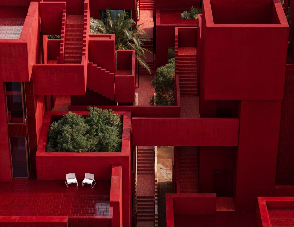
An architect loves a raw finish, such as concrete, but when you differentiate this with the colors and textures that a resident brings through different decorative sources, it becomes valuable to admire that. Some of the best architects have, in fact, done that, prioritizing color and texture. You can look at the works of Ricardo Bofill, and in a split second, you will feel a certain explosion of colors that clears the barrier, evoking emotions and giving a character to the building and the surroundings.

Final Words.
I hope this was a helpful read to understand color in architecture. There are thousands of ideas that showcase how an architect has utilized their perception and experimented for lord knows how many days to come up with a color palette that is worth studying. We cannot end this topic with a single article, and it is a continuing process of learning from others and experimenting to finally design a distinguished monument through color. However, if there are any questions you have, I’d love to answer them in the comments below.
Resources.
- Featured Image: Red Sol Resort Dhërmi; Image by MIR, via Bofill Taller de Arquitectura.
- The Laws of Contrast of Colour: And Their Application to the Arts by Michel Eugène Chevreul.
- The Symbolism of Color by Faber Birren.
- Color for Architecture by Tom Porter and Byron Mikellides.
Related Reads.


