Decor, as a spatula, is the ultimate tool to shift the layers of your interior cuisine and psychological vapors if done right. However, as easy as handling this spatula sounds, given you are not a designer Cuistot, it can be harassing to rush through the different ingredients and understand their palette and role. For instance, if I have to get back to familiar and more common terms, let’s say your home adores the beauty of English Decor, and amid the most luxurious choices, the dullness or overly boldness of your colors is distracting; this may not only fade the capabilities of your decor but can often make you question what is really wrong with any room or possibly the complete home. To solve this, I am giving away 8 easy and actionable tips for designing your own interior color palette. Let’s start!
Understanding the Importance of a Color Palette for Home.
To most of us, our home is a century of pleasured brain and a place we spend most of our time. It is amusing if I need to stress this point, but choosing a color palette for a home is not only essential to make it look good or repair the walls and prepare it for a sale, but also work on the psychological impact as well as the character of the space. For instance, you will find a dark room with chocolate cosmos or burgundy cozy and appropriate for sleep, as our Pineal Gland secretes Melatonin in response to darkness, further effective for good sleep. In contrast to this, the colors that are most suited for freshness but calmness in the environment of a room are either lighter shades of yellow, blue, or green or neutral palettes or white. Some of the excellent examples of the latter are from Zen-style interiors like Timberwolf.
After we decide on the color for the interiors, we want to stabilize the mood and configure it per our standards. This is done by picking the right colors or materials for flooring, furniture, and fabrics. And to follow this in its most largeness, an interior color palette is necessary.
Continuing from the previous paragraph, it is crucial to know that an interior color palette is not limited to picking three or four colors. Instead, it relies heavily on stabilizing the interiors. For example, if there’s a bathroom with a tone of blue and white, it will appear bland. On the other hand, a bathroom with a careful tone of blue, an accent of gold, and a curated touch of colors like Beaver, Caput mortuum, and white can bring a change of a lifetime. Moving further, you can enhance this with plants, artworks, lamps, and ceramic objects; this is how we get close to creating the perfect color palette for your home. Note how many things we used but it is just the right combination of colors that not only stabilize each other’s presence but makes the room go from boring to beautiful.


8 Tips For Selecting the Perfect Interior Color Palette.
1. Do Not Ignore the Basics of Color.
We all have learned enough about color and light in our schools, and I am not asking you to recall them in a precise pattern, but I do advise you to consider your color palette like it is an easy science experiment. Confusing? It will all start to make sense once I take the following few paragraphs to explain.
You might be familiar with the color wheel; if not, it is a tool that has 12 colors laid in a circular form to understand their relation with each other. The reason why you should value it while choosing a color palette for home is to pick colors that go together.

For instance, if you want a harmonious interior color palette, you will be required to pick colors, including a primary color if you like, that are adjacent to each other on the color wheel. A color palette that I designed following this can be found below.

This is only a start and slowly with our enhanced knowledge of light, mood, and accents, we will beautify it more. For example, look at the following palette with an additional accent. Take the #e9ffad as the interior color, #a8e4a0 and #829f82 as accent colors, #ffe085 for your furniture to lessen the balance and lessen the impact of the greens, and #291f00 for crockery or a subtle finish that invites luxury and cuts the effect of greens.

In case, you want to add a character to the space with a color that is too contrasting, the results can be outstanding if you pick a color opposite to another on the color palette. To understand better, take a look at the following color palette.

Unsure of how they will work out? Think of a lavender-colored wall and a yellow-colored chair paired together.
2. Play around the Colors You Love.
It is essential to prioritize your favorite color when painting your interiors. Knowing there are some favorites that might not go right with different rooms, I suggest using a color wheel or a fancier tool like Coolors where you can enter your favorite color’s HEX code and then adjust its intensity and accordingly decide a shade that is suitable for you. This way you get to keep your interiors delightful and not compromise on your choices. The following palette shows similar tones of the same color (Pink) in descending order for their intensity on a color wheel. This way you get to keep your favorite color pink but adjust its intensity to create a beautiful impact on your interiors. You can do the same for other colors as well.

3. Pair Colors That Work Together.
Through the previous points, you might have understood how a color palette works and how we can use a color wheel and other online tools to get an idea of it as well as decide whether or not we can use a shade or tone of our favorite color. One of the things that you might still be facing problems with is how to actually not confuse this pairing and closely verify that the colors you have picked really go with each other and are not completely based on scientific or digital means.
To address this I suggest following a few rules when coloring your interiors and picking a palette for the same.
1. Always keep darker tones of warm colors like orange in moderation. Not only do they go with the Browns, but they can also be paired with cooler tones of grey and certain shades of blue if done right.

2. All reds go together and so do all pinks. You can also pair reds and pink to create majestic floral and pastel interiors and even a passionate palette for your living room.

3. Neutrals and Greys are some of the most popular colors of the present. They can be paired with almost any color, and if done right, they will look fantastic.

4. All blues go great together and can be paired with greens and violets.

5. Violets are known for bringing luxury and darkness to a room, and they go well with blues and greens and even mixed with red and pink to create a unique look.

6. Use yellow to create fresh environments and they go well with greens and oranges.

7. Greens can balance many color palettes and are the most friendly color to go well with most shades on the color wheel. Note that the following card is not a color palette but provides a quick idea of how green interacts with different colors.

8. Browns are great for bedrooms and creating a sense of coziness, and they go well with warm colors like orange.

4. Use Nature to Design Palettes.
We have learned the scientific basics and a few rules experts believe, and now it is time to look at nature. Let’s be honest, the best artists are those who learned the nature, and while we are not going to do the same, I want you to take a few pictures that not only depict nature but have colors that appeal to you. If you are still lacking in how to design an interior color palette, I advise you to follow this tip. Let’s take a look at the examples to understand better.


Once you have the shades, play with their intensity (either light or darker) and visualize them in any interior you want them to be. This extra effort ensures that you are not creating a forest but a home.
Note: This is only for inspiration on how colors mix and match and how nature can help you pick a palette but you will always need to adjust them for a better look.
5. Look at the Light Before Picking Shades.
Scientifically and Theoretically, light is one of the most crucial factors in deciding an interior color palette. It not only helps you understand how your home will feel under natural light, but also how will it pair up with artificial means, such as task, ambient, and mood lighting. To accomplish this area with utmost precision, I suggest you take note of natural light in your space at different times of the day. Further, you should understand that as seasons change, natural light in your space will do as well.
Now, speaking of the rules you need to follow here. Choose bold colors and use contrast to better your space in a darker atmosphere. Use shades of red and pink in this case. In case you have a lesser or moderate light, similar to northeast spaces in the northern hemisphere, warmer colors can reduce the impact of shadows. Lastly, some of the best colors that work under brighter lights and create a cozy atmosphere are coffee browns and warm earthen tones.
Once you have your dominating colors, it is time that you pick the lights, namely task, ambient, and mood lighting. The purpose of these lights are to provide enough illumination for reading or another task, being a source of general lighting of the room, and setting a softer and moody touch to the room, respectively.
Speaking of the changes in lights during winters or different seasons, taking case that the brightness decreases, dress your furniture with throw pillows, curtains, throw blankets, and rugs. I will talk more about how you should use these in general to create an interior color palette, but for now, you should understand that the palette of these in darker shades should be richly colored, such as sunny yellows or reds, and work to make the room cozy.
To help, I am attaching color palettes with examples of spaces that adore it and also showing how lights should be used for the optimum use of these shades.


6. Choose Colors Suitable for Your Mood.
We have learned the basics of choosing a color palette for home, but it is time to understand how different colors change moods when applied to a space and that you must follow this tip to give a certain character to the space. I am attaching a table to understand the different types of colors and their moods.
| Colors | Moods |
| Pinks | Feminine, pleasant, lively, and fun |
| Reds | Passionate, intimate, stimulating, and comforting |
| Blues | Calming |
| Yellows | Represents summer and is good for the brain |
| Oranges | Warm and cozy |
| Violets | Emotionally attractive |
| Greens | Freshness, healing, and balancing |
| Neutrals | Serene and balancing |
7. Use the Colors of a Picture.
I understand if you are still doubting your capabilities in designing an interior color palette, and without arguing or sharing convincing statements, I will share one of the easiest tricks- Copy Your Favorite Picture!
To do this, you need to find a picture that soothes you and presents the perfect composition of colors, following the rules stated in the previous steps. Once you select an image, upload it to the Coolors and accordingly pick colors for a template that works for your interiors. The following image will explain better.

If these inspirations are still not what you prefer and seeing pleasant interiors works for you instead, I recommend browsing websites that award designers for their choice of colors in any project. One of these websites is Dulux and you can filter these projects by types, such as commercial exteriors, commercial interiors, residential exteriors, and residential interiors.
8. Apply Every Rule Rightly and Plan Your Steps.
By now, you might have the right understanding of how to design an interior palette, and in this step, we are going to learn how we are required to implement it correctly. You might have noted how I picked five colors and how one of these colors was a little blended but also attractive, compared to others, or should I say it is the green color.
Let’s start with the first shade you want your home to revolve around. After you successfully decide on it following the previous steps, we will pick a color that is adjacent to it on the color wheel.
Once we have these two colors, we will add a color to cut their overpowering effect. For this, you can add a shade of green, but it completely depends on what other color you would like for your interiors to boast.
We have three shades, and now it is time to prepare accents and shape our interiors as we require. Preferably, you should consider the surroundings you will create with the three colors you have already chosen, and then decide on whether you want to add warmth or coolness to it. Accordingly, choose one color shade and pair it with an adjacent color on the color wheel.
For example, if you have grey and bland interiors and you want to add warmth to them, you can add warmer tones through artwork, a rug, and throw pillows. Normally, you would like to pick a painting that has the dominating color of one of the accents. Next, the color of the rugs and your throw pillows should interplay or contrast, as per your choice. Lastly, you can also add luxurious touches through darker palettes to your grey interiors with crockery or shiny surfaces, such as a vase that can keep your plants balancing everything.
Quick Tip: If you don’t have your sofa already, you can use it for your color template as well. Furnishings, Flooring, and walls are crucial parts of the color palette.
Takeaways.
To summarize what we have learned so far about the interior color palette; you should always pick your color as per your preference but from a color wheel or other inspirations. Following this step, if you don’t have a palette already (considering you are not completely relying on inspiration), you should pair them wisely with colors that have a balancing shade and a couple of accent shades. Note that successful palettes are those that also consider the lighting and mood, and with it, you can go far to make an impact.
I hope this article was helpful to you, and if there are any questions or even if there is a room that you are confused in regards to what color you must choose, use the comments section below, and I will try to help you wholly. See you next time!
Resource.
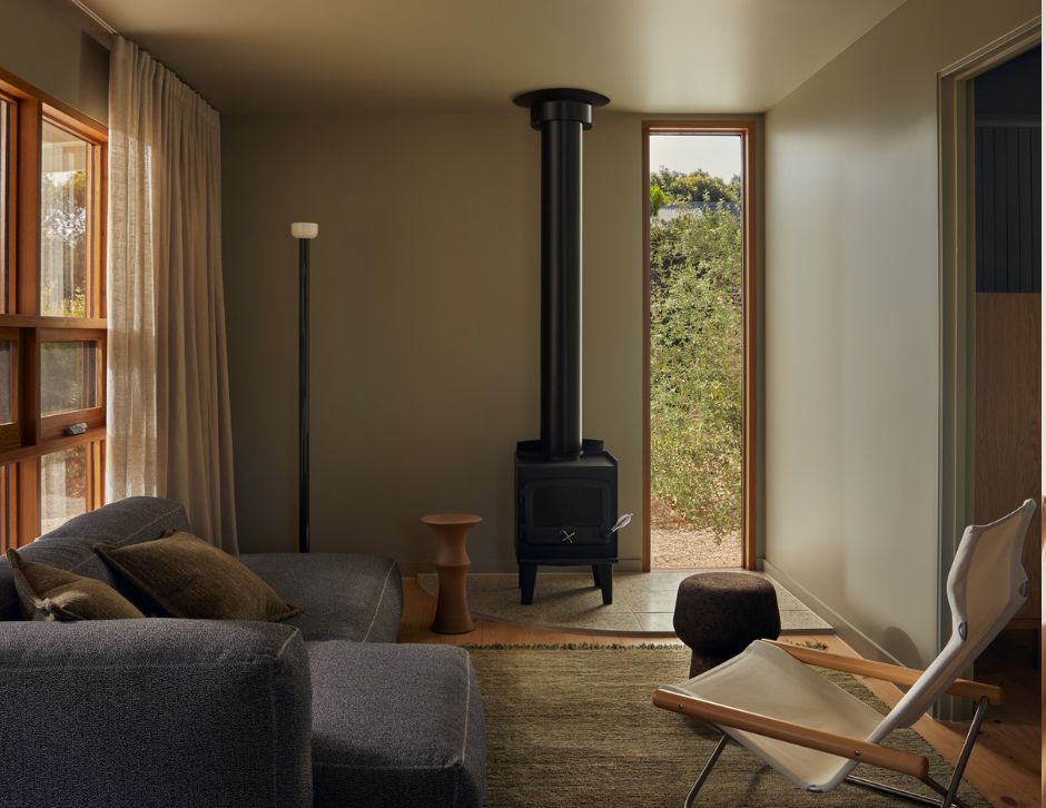
Featured Image: Lillie Thompson, via Dulux Colour Awards.
Related Reads.


