
There is a simple explanation of why elements of art are crucial: the arrangement of these elements imposes order. For instance, I will take an example of Henri Matisse’s painting Piano Lesson, where every element, including color, line, and shape, directs and governs the composition. The painting includes the pea-green wedge of drapery at the window over the iron grillwork. This similar iron grillwork is complemented by the curvilinear lines of the music desk. In the upper right background, an enigmatic figure is portrayed by the artist, whose other sculpture is kept in exactly opposite diagonal direction. The contrast, shadows, and repetition further remove the unwanted isolation from this painting, but the tense face of the boy still gives a watchful eye to the woman seated behind him. The use of repetition, cacophony of shapes, and excess space for each object collectively strikes a psychological impact on the viewer. The colors here balance each other while providing a genuine feeling of serenity. Artists have portrayed several emotions throughout history through the use of color, line, shape, and movement, as these are the visual grammar of art. To understand art more particularly painting and sculpture, the basis lies in its elements, which is why I am writing this article.
But before we move on to the article, let me quickly introduce you to today’s book recommendation.
Today’s Book Recommendation.

The Red Book by C. G. Jung.
Imagine a book written by a renowned psychiatrist plunging into his own unconscious while wrestling with visions, dead spirits, and gods, which came out in public in 2009, nearly fifty years after his death. The Red Book is all about a dream that is deeply illuminated and filled with mystery, madness, and breathtaking beauty. For people who actually read about the subconscious, unconscious mind, and want to know what exactly stirs up in another dimension, this book is for you!
Detailing the 7 Elements of Art.
1. Line.
In the 1912 book by Kandinsky, Concerning the Spiritual in Art, the author emphasized the spectator’s response to the type of line, shape, and color used by the artist in his compositions. And it is certainly true that every single emotion and expression can be discerned by line. Though it looks like a simple element, it is one of the most difficult forms to comprehend, as it communicates between the spectator and the artist.
From geometry, we know that a line is made from an infinite number of points and the shortest distance between two points is a straight line. Starting from the characteristics of the line, the measure of any line is its length and width. For instance, in The Starry Night by Vincent van Gogh, several swirl lines are carefully plotted in a way that it looks like a mathematical relationship intrinsic to the work. In the case of Jackson Pollock’s Number 14: Gray, the lines are typically steeper and broader at the center, almost like an illusionistic effect with the narrower lines at the far distance. These overlap and swell, creating a flow of freedom. However, if you look at the Aavartan by S. H. Raza, the lines portray an infinite flow and freedom from any constraint. The line further shows the expressive characteristics of the painting, as it can be perceived as delicate, tentative, elegant, and forceful. Every single painting has this element, and it never detaches itself from the emotional response of the human. In the case of Van Gogh’s Starry Night, the swirling lines portray a heavy emotional response, whereas in Raza’s painting, the continuous lines portray harmony and spiritual values.

Types of Lines.
1. Contour Lines.
Contour lines are simply the differentiating lines that are created by the edge of things. For instance, keep your arm in front of the wall, and the differentiating edge is a contour line. In every three-dimensional shape, these lines curve back into space.
2. Actual Lines Versus Implied Lines.
The actual lines have connected and continuous points, whereas the implied lines can be seen by the viewer as these can be discontinued lines which the viewer reads to understand the overall context of the image. In the Madonna On the Rocks by Leonardo da Vinci, an invisible pyramid encloses the figures, and these lines are implied lines. At the apex, the Virgin Mary sits, and by the extension of her arms and direction of glance, two suggested implied lines can be made with the endpoints of baby Jesus and infant John the Baptist.

In several Renaissance paintings, implied lines further create the structure of the composition.
3. Invisible Lines.
The mental or perceptual connection creates a psychological or invisible line. It can simply portray a particular gaze, gesture, etc. For instance, in The Nameless and Friendless by Emily Mary Osborn, the stares by men and the gesture by a woman show the invisible line pointing. These psychological or invisible lines are called compositional lines.

Now, the element line has several functions. For instance, it gives outline and shape to any object in the painting or creates distance and depth in the composition. It can also create movement and even allow the viewer to move their eyes in a particular motion to give it meaning. While suggesting movement and expression, the horizontal lines normally suggest stability, and the sweeping verticals defy assertiveness. However, the diagonal line portrays a powerful sense of emotion, including a tense environment.
A General Example.
Let’s take an example of The Birth of Venus by Botticelli, where the direction and movement of the painting are portrayed by the gazes towards Venus, making compositional lines. Further, the outlines clearly carve out the figures through contours. The movement of the painting can be seen through the rigid horizontal lines of the horizon and the verticals of the trees, with straight lines. Further, there are straight lines through Zephyr’s breath, giving an overall triangular structure.

2. Shape, Volume, and Mass.
The word “shape” instantly describes the physical contour of any object. But it also elucidates psychological settings when we usually say how situations shape a person or how childhood shapes a person’s behavior. Hence, such expressions suggest a definition of the term shape, which is nothing but defined boundaries that distinguish it from its surroundings. In the paintings, shapes are defined as the areas in a composition with boundaries differentiating them from the surroundings.
In every painting, shape is communicated by the lines that enclose the particular areas. It can be depicted through color or texture. So a shape is enclosed space defined by edges, colors, and textures against a background. For instance, in the Rakta Bindu by S.H. Raza, several shapes of squares and circles are included.
Coming to the word form, it often describes a shape in architecture or sculpture. However, several people use “form” to describe two-dimensional and three-dimensional works of art. The word ‘volume’ refers to the bulk of the three-dimensional work and conveys a sense of containment. Geometrically, volume is the length multiplied by the width and height of an object. However, in art, we use the term volume to portray its enormity.
Similar to volume, the term “mass” is widely used in art. In physics, it simply means the amount of force required to change an object’s location or movement. Hence, objects with more mass are harder to budge. In art, this mass is its bulk. For instance, the sculpture David by Michelangelo has more mass. Now, in mass itself, there are two other terms: implied and actual mass. For instance, you see a large sculpture; you can feel that a certain kind of force will be applied to it to change its location or movement. Since you are actually applying this force, the mass of this object is actual mass. Whereas, if you look at any painting, then any object depicted in three-dimensional form has an implied mass, which means that they create an illusion of possessing volume, occupying three-dimensional space. For instance, in Leonardo da Vinci’s The Last Supper, the figures and objects were given a three-dimensional structure, emphasizing the implied mass.


Types of Shape.
The geometric shapes are regular and precise, like squares, rectangles, or circles. However, the shapes made up by curvilinear or straight lines are also geometric shapes with an unnatural and mathematical appearance. Then there are organic shapes, which take their appearance from nature, including animals and plants. The studies of several artists depicting animals and plants show organic shapes. However, some organic shapes can be irregular, soft, harsh, or angular. Similarly, geometric shapes formed by the intersection of straight lines are called rectilinear. If curving lines intersect to form shapes, then the shapes are called curvilinear. To see shapes more clearly and differentiate their types, you can refer to Cubist art, including that of Picasso’s. For instance, in Picasso’s art, the human body is given the geometry of organic forms. In contrast to Picasso, Colescott’s women were well-rounded, with organic and real counterparts to Picasso’s geometry. Lastly, few paintings have shapes that seem to be taken from biological entities, and these shapes are called biomorphic shapes. The boundaries are unyielding in the biomorphic shapes, as they can ebb and flow, expand and contract as directed by some inner life force.
Positive Versus Negative Shape.
In any painting, the positive shape is what the viewers focus on, whereas the negative shapes are the empty spaces filled. Positive and negative shapes in a work of art have a figure-ground relationship.
General Example.
In The Birth of Venus by Botticelli, the artist used several shapes, including the curvilinear shapes in Venus’s body. Further, biomorphic shapes are also included in this painting through the sea coral on which Venus stands. Talking of the negative and positive shapes, the focus of the viewer remains on Venus, which makes it a positive shape, whereas the space in the background is the negative space.

3. Light and Value.
Light in physics is the part of the spectrum of electromagnetic energy that has radio waves and cosmic rays. Measured in wavelength, light and darkness are often distinguished through this. Light usually makes it possible for us to see points, shapes, and textures. Light against dark or dark against light in the language of art is called value. In other words, the value of a color on a surface is its lightness or darkness. The value is determined by the amount of light reflected by the surface; the greater the reflection, the lighter the surface, and vice versa.
There is one more word in terms of value: value contrast. It refers to the degree of the difference between shades of gray. In other words, the relative lightness and darkness are called value contrast. For instance, look at the figure below. The circles in the squares remain the same color, but the squares’ color changes. This change is the value contrast. The term “value pattern” describes the variation in light and dark within a work of art. This value pattern can be low-contrast or high-contrast. In the Rubens paintings, the works are high-contrast.
Chiaroscuro.
Several artists create the illusion of three dimensions on a two-dimensional medium through a gradual shift from light to dark by successive gradation of the tones. This pattern of the values, or the shift of light to dark by the successive gradation of the tones, is called chiaroscuro. In a painting, when your eyes move from light to dark through several tonal layers, an object painted in two dimensions seems three-dimensional. This very creation of several layers of different tonal values is chiaroscuro. In all of the paintings of Caravaggio, you can see the chiaroscuro. In The Calling of St. Matthew, deep and dramatic shadows through tonal value changes are created by the artist.

Expressive Properties of Value.
If you look at the values of the darker shades, like black and gray, combined with the white shade, they usually describe the objects to evoke emotional responses in the viewer. In several sketches of Käthe Kollwitz, including Misery, Call of Death, and Old Man With Noose, the darkest tonal shade is combined with the whiter aspects to evoke intensified emotional responses in the viewer. The black and white colors have this expressive property or symbolic association with the emotional and psychological settings.

In the Self-portrait by Picasso, he used charcoal’s color gradation tones through shading, further delineating the facial features of his composition. Hence, sharp contrasts are eliminated in a uniform flesh tone. In effect with this, soft shadows on the sides of the nose and cheek are built up. Hence, chiaroscuro—an intermix of darker and lighter shadows—creates an organic and subtle shape in a composition. Similar to this, darkness and lightness overlap, and dominance also portrays dark themes like death. In The Incantation by Goya, the darker tonal values are emphasized to portray the themes of evil and death.

4. Color
Color is the central element in the language of art, without which no message can be delivered. Vincent van Gogh expressed his turmoil, nostalgia, peace, and disasters through several color combinations with different strokes. He used colors for more of his emotive qualities rather than for its infidelity to nature. In several abstract paintings, color seems to be pretty much the message communicated by the artist. Three terms that are psychological dimensions of color and are significant to understand are hue, value, and saturation.
The wavelength of the light determines its color or hue. Hue is a particular shade, such as yellow, red, orange, green, indigo, or violet. Now, the value of a color is its degree of lightness or darkness. Value in color is similar to value in light—the darkness or lightness. The value of a color can be best seen through the color wheel. Sometimes this value is also known as brightness when we talk about light mixtures. In other words, it is the degree of the lightness or darkness in a color, and in pigment mixtures, it can be adjusted by the addition of black and white. For instance, in Georgia O’Keeffe’s Black Iris, the only hues used are purple and red-purple, with the lightest values called “high” and the darkest referred to as “low.”


We do know the warm and cool colors, which are decided by temperature. Colors on the green-blue side of a color wheel are cool, while those on the orange-red side are warm.
Lastly, the saturation of a color is its purity. Pure hues have greater saturation, and vice versa. Saturation, and therefore intensity, decreases when you add another hue, black, or white. Furthermore, colors decrease in saturation when they approach the gray in the center of the wheel.
In The Scream by Edvard Munch, the saturation of red and blue colors is higher.

1. Additive and Subtractive Colors.
When you mix different pigments and colors, the original colors are lost, which is why we call mixing pigments subtractive. In additive colors, the rays of colored light are mixed with another ray of color to produce a lighter color and white. For instance, by overlapping orange-red, blue-violet, and green, there is a production of white color. In case of mixing equal values of pigments, the resulting darker color is composed because of the more wavelength absorbed.
Lastly, you should always know the primary and secondary colors. Primary colors cannot be derived from mixing other colors of light. They are red, green, yellow, etc., whereas the derivative colors are secondary colors. The overlap of blue-violet and green creates indigo, so this indigo is a secondary color.
2. Complementary and Analogous Colors.
Two colors that are just opposite to each other on the color wheel are called complementary colors. Though they gray each other when mixed, they intensify each other optically when they are placed side by side.
The colors that lie next to one another on the color wheel are called analogous. These colors usually form families of color. For instance, yellow and orange, orange and red, and green and blue are analogous colors. If you look at The Night Café by Vincent van Gogh, the colors orange-red and green are clashing complementary colors, which are used to create an intense mood in the composition. However, the same yellowish-brown on the floors and orange-red walls are analogous colors. In between the two complementary colors, analogous colors can be seen in this composition.


The triadic color scheme uses colors that are evenly spaced around the color wheel. In the triadic color schemes, the colors can be carefully balanced when one color dominates, and the other two colors are accents.
Theories of Color Relationships.
To work with the colors and, particularly, colored pigments, there must be a great understanding of the colors. What colors should be mixed and what mixtures actually relate to each other visually. For this, the theories of color are read. Starting from the oldest, the ancient Hindu Upanishads developed the theories of color vision. Similarly, the early Greek philosophers and physicians also developed them.
In the Chandogya Upanishad, three colors (triadic) are considered the foundation in the material universe. These three colors are red, white, and black. The red color is the representation of fire, the white color portrays water, and the black color represents earth. Later, the Vedic texts narrated the Samkhya philosophy of the three Gunas:
- Sattva: Purity, clarity, and light (represented by white),
- Rajas: Passion, energy, and action (represented by red), and
- Tamas: Darkness, inertia, and heaviness (represented by black).
There are several other color theories, which I will explain to you in another separate article.
As per Leonardo da Vinci, he always used simple colors: white, yellow, green, blue, red, and black. In his later artworks, he used the phenomenon known as simultaneous contrast, which demonstrated that complementary hues intensify each other when juxtaposed. Further, through different tonal values, he described aerial perspective and shadow effects in his compositions. At the later stage of his career, he developed sfumato, where the subtly graded values and hues of chiaroscuro softly blended, almost with a smoky quality, giving an exemplary quality to the artworks like the Mona Lisa.

5. Texture
Texture, in simple words, is the softness and coarseness of a cloth or material. The word “texture” comes from Latin for weaving, which describes the surface character of woven fabrics. In the elements of art, texture is something that undertones or exaggerates the emotional state of the artist, further providing the empathetic response of the viewer. In several of Vincent van Gogh’s paintings, texture plays an important role in creating an emotional response within the viewers.
Types of Texture.
1. Actual Texture.
When you touch an object and you feel some kind of actual physical sensations like roughness, smoothness, sharpness, or hardness, the texture is an actual texture. In Sunflowers by Vincent van Gogh, you can actually feel the surface texture as he uses the impasto technique to create an actual texture. When an artist portrays gestural brushstrokes to express his/her emotions and sensibilities, he uses actual texture in his compositions.

2. Visual Texture.
In any painting, an artist uses line, color, and other elements of art to create an illusion of various textures, referred to as visual texture. In Rachel Ruysch’s Flower Still Life, the artist makes painstaking details of flowers and leaves, but the texture in the composition is simulated. In The Paris Street; Rainy Day by Gustave Caillebotte, the texture of the composition is hazy with little crack of clarity. In another painting, Young Hare by Albrecht Dürer, the artist paints even the skin of the hare with such perfection, almost creating a subtle visual texture.


3. Subversive Texture.
Subversive texture is an artistic technique, where the physical or visual texture of an object contradicts the viewer’s expectations. The best example of subversive texture is Meret Oppenheim’s Object, where he lined a fur texture on the cup, saucer, and spoon. The subversive texture can simultaneously attract and repel the viewer.
6. Space.
In the movie, the Backrooms’ extensive space creates an illusion of nothing less than a vast area. In a room, subtracting the furniture and people shows you the space. Used in art, architecture, and even in interior design, space is nothing less than an illusion to the human mind.
Several techniques, like overlapping, relative size, and linear perspective, transcend space.
Overlapping.
When several nearby objects are placed in front of more distant objects, they all obscure parts of the distant objects. In the figure, two circles and two arcs are composed; they, however, seem like four circles, two in the foreground and two in the back. This overlapping of objects is used by several artists to create depth in the paintings. In The Three Musicians by Pablo Picasso, the artist used overlapping objects to create perceived depth and merging forms.

Relative Size and Linear Perspective.
Objects in the distance are smaller; they appear to the eye. This simple principle of relative size is important in spatial complexity in several works. Let’s start with the three principal areas of a space: foreground, middle ground, and background. The foreground is the closest space to the viewer in a painting, where the objects are the largest in scale. The middle ground is the transitional space that is situated between the foreground and the background, where the objects remain medium-sized. Lastly, the background is the space that is farthest from the viewer. This is achieved by linear perspective.
Final Words.
Elements of art are crucial and must be studied before learning any painting. In the 1960s, the main initiative in art and design was known as the Basic Design, and these were included in it. The teachings were given by Paul Klee, Wassily Kandinsky, and others at the Bauhaus in Germany and the Black Mountain College in America. This structure of learning art made it simpler for us to read paintings and other forms of art. In my next articles, I will be writing on principles of art.
Frequently Asked Questions.
The 7 elements in art are line, shape, light, color, space, texture, and form. Every single element is crucial to read, analyze, and learn the concepts of art.
The 7 elements in art are Line, Shape, Light, Color, Space, Texture, and Form, whereas the 8 principles in art are Unity, Balance, Emphasis, Rhythm, Scale, Proportion, Movement, and Harmony.
Resources.
- Understanding Art by Lois Fichner-Rothus.
- Color by Paul Zelanski, Mary Pat Fisher.
- Visual Elements of Art and Design by Frederick Palmer.
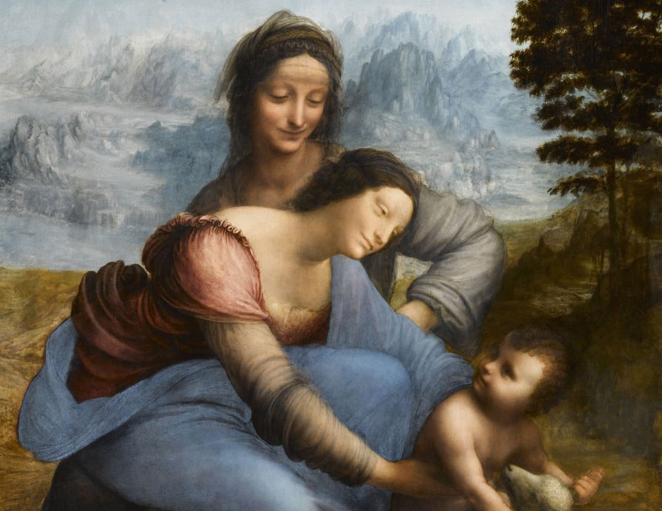
- Featured Image: The Virgin and Child with Saint Anne by Leonardo da Vinci; Leonardo da Vinci, Public domain, via Wikimedia Commons.
Related Reads.


